Heatmaps applied to emails reveal valuable information about your contacts’ behavior: where their attention is focused, which elements attract clicks, and which are ignored. But to turn this data into real optimization levers, you need to know how to interpret it. Here’s how to take advantage of heat zones to improve the performance of your e-mails.
The different heatmap in an email
Heat zones are valuable tool for your A/B tests
Our checklist for optimizing your emails
The different heatmap in an email
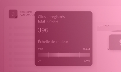
The different heat zones in an emailAn email heatmap highlights different zones according to reader activity, hot zones (high interaction), warm zones (medium interest) and cold zones (little or no interaction). This visual mapping helps you understand where clicks are concentrated, where the eye stops, and above all, what content goes unnoticed. By adapting your content to these zones, you optimize readability, message prioritization and, ultimately, engagement.
Hot zones: capitalizing on attention
Hot zones correspond to the parts of the e-mail where your readers focus the most. They’re often found above the fold (the part visible without the need to scroll), around an eye-catching visual, or near a well-positioned CTA.
It’s in these areas that your high-stake elements should be located around the main button, key message and flagship offer. By positioning them in the hot zones, you naturally increase the chances of clicks and conversions.
? If you notice a hot zone around a button… but it has few clicks, this may indicate a block in wording or readability.
You can try to rework the button title to make it clearer or more engaging, add a complementary visual (icon, arrow) and test a different color or stronger contrast.
Warm zones : optimize opportunities
Warm zones are between two extremes, they are neither totally ignored or particularly solicited. They indicate transit points, moderately consulted content, or elements that arouse partial but not decisive interest.
These zones are often under-exploited, even though they can become real relays of engagement… provided you work on them properly. You need to consider warm zones as levers to be activated. To do so, ask yourself the right questions, like, is the element sufficiently visible? Is the content proposed there clear and attractive? Is the design a natural eye-catcher?
You can then take action at different levels by clarifying the message to make it more powerful (avoid vague or generic wording). You also can add a visual touch (pictogram, highlight, box) to capture attention. You can change the order of blocks, in some cases, a simple change of position in the email is enough to transform a warm zone into a hot one.
? These areas are great for testing secondary CTAs, additional content or other messages (for example, soft prompts like “Learn more” or “See details”). This helps engage readers who are less receptive to the main elements, without overwhelming already busy areas.
Cold zones : detect and correct ignored areas
Cold zones, on the other hand, show the areas of the email where attention is waning: few clicks, few glances, or even no interaction at all. They are often located at the bottom of the email, or in sections that are not very visible or engaging.
You need to ask yourself whether the elements placed in these areas deserve to stay there. If a secondary CTA, complementary offer or important information is located in a cold zone, move them up in the email, or make them more visible:
You can rework the design and airing out the content around them or simplify their presentation.
? Some ignored content may simply be superfluous. In this case, you can clean up your message. A shorter, better-organized email captures attention better and converts more.
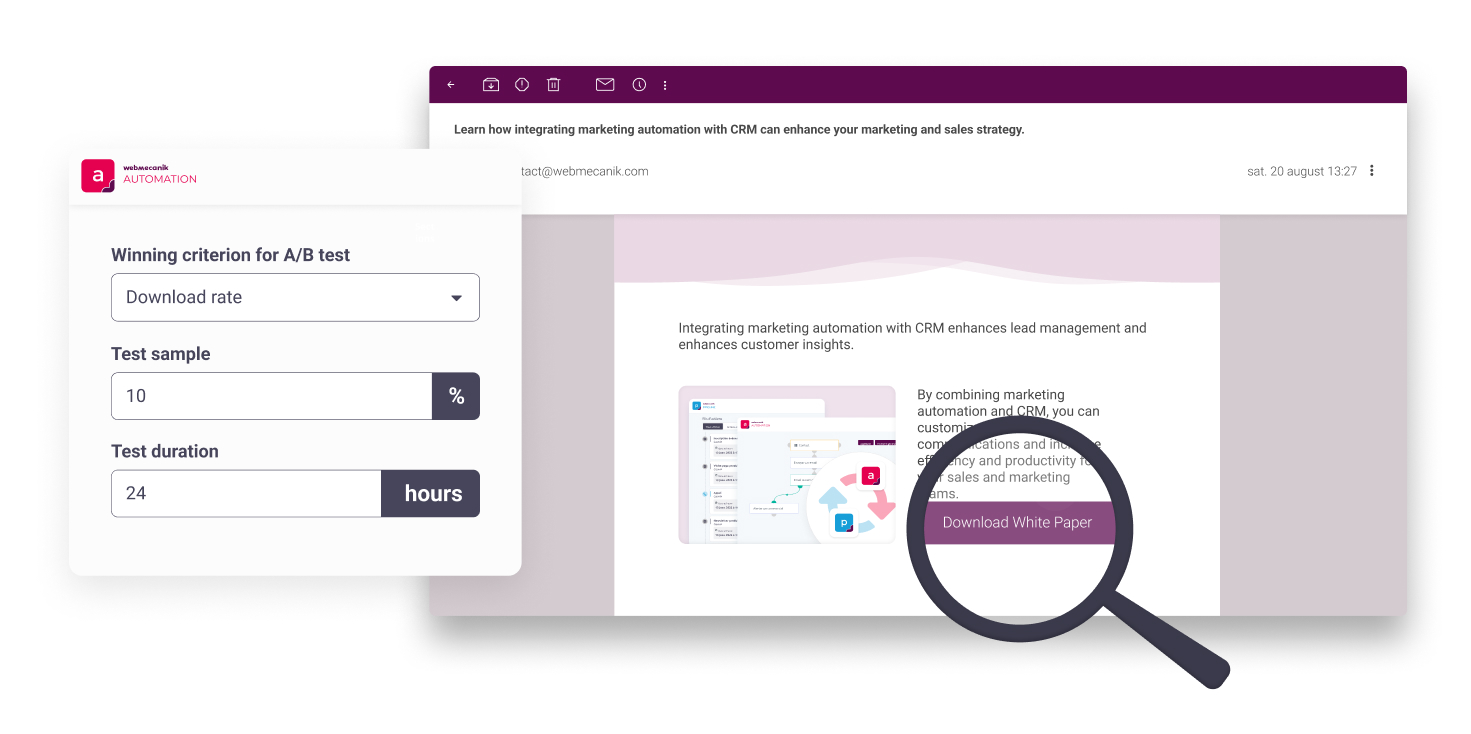
Heat zones are valuable tool for your A/B tests
|
One of the best ways to use heatmaps for emails is to combine them with A/B testing. Test different placements for your key elements (CTAs, images, offers) and analyze heat zones to see if adjustments make a difference in terms of engagement. For example, if there’s a call-to-action button at the beginning of the email, but the click rate remains low, test it with different text or a more contrasting color. You’ll quickly see if the adjustment increases interactions in this hot spot. |
 |
Our checklist for optimizing your emails
Review these essential points before sending your next email to make the most of your heatmap insights.
- Are hot zones well exploited? Are your CTAs, main offers or key messages positioned in the most visible and engaging areas?
- Can lukewarm zones be optimized? Have you reworked medium-view content to better capture attention (design, wording, hierarchy)?
- Do cold zones contain important elements? Identify ignored content: should it be moved, redesigned… or deleted?
- Have variations been tested? Use your heatmaps as a basis for targeted A/B testing: button placement, wording, visuals… every adjustment can make a difference.
- Do clicks lead to real conversion? Analyze the post-click path to check whether hot zones are not only attractive, but also perform well in terms of results.
By combining visual analysis and strategic optimization, heatmaps become more than just reporting tools, they become real levers of action for creating more effective, clearer and more engaging emails.


