
There are several techniques to collect visitors’ email addresses from your website and integrate them into relationship programs (newsletters or others). All these inbound marketing techniques spread quickly. We’re going to introduce you to the main ones. We chose to focus in 2020 on the 5 most effective techniques. Enjoy reading!
Deploy “smart” popups
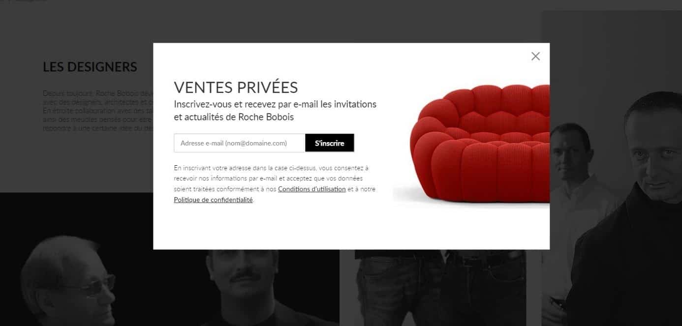
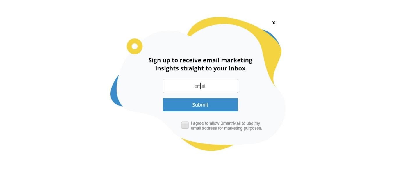
Popups are probably the most popular way to collect email addresses on the web. There’s no doubt that you’ve already come across them popping up in the middle of your screen while you’re loading a page. Their omnipresence on the internet is due to two factors:
- The ease of setting them up
- Their effectiveness.
Adding a popup to your site, along with a form, is a very effective way to increase the number of newsletter sign-ups. Their ease of configuration and low cost add to their appeal. The only downside of popups is that they can be irritating for your visitors—especially if someone has trouble figuring out how to close yet another popup that blocks the content they’ve been trying to access since the start of the day. If you’re worried that this could happen to your visitors, there are variations on the typical popup you can use to make them less intrusive. This is the case with delayed popups. If you want to find an effective way to keep your popups from annoying your visitors, have them appear only after they’ve met certain criteria. Common examples of these criteria include:
- Spending a certain amount of time on your site,
- Visiting two pages or more,
- Scrolling through to your blog posts.
The downside of delaying your popup is that fewer people will see it. If fewer people see your popup, it will probably also mean fewer sign-ups. However, it also means that the people who stay on your site long enough to see the popup are likely more qualified prospects and therefore more valuable to be on your mailing list. This leads to better open rates when you send an email. Determining whether delaying your popups works for your site will likely require running a test. If you find that they don’t cause a significant drop in conversions, the inconvenience you save for your visitors will be well worth it.
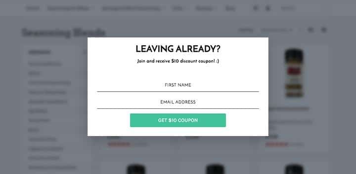
Use exit-intent popups (exit popup)
Exit-intent popups appear to users only when they’re about to leave your page. These are relatively new and rely on tracking people’s mouse movements to detect the moment someone is about to leave your page. These popups are ingenious for two reasons:
- First, they don’t interrupt visitors or the reading of the content they came to your site for.
- Second, displaying a popup on the screen a fraction of a second before someone leaves the page forces people to stop what they’re doing and pay attention to the popup.
When combined with other email collection methods, these popups give you a second chance to capture someone’s email address.
Displaying a small bar at the top of your page that remains when visitors scroll down will catch their attention without being annoying. Usually, these bars are used to inform visitors about an update or an announcement, but there’s no reason you shouldn’t add a subscribe button to it.
By being located in such a visible part of your site, you make sure that everyone has the option to sign up for your mailing list if they want to. Including an incentive offer that tells visitors why they should sign up will lead to even more conversions. In addition, if you give this famous bar a bright color, you can be sure it will be noticed right away. A service like Hello Bar is great for easily adding a top bar to your site.
Also read: Lead magnet: everything you need to know about this inbound marketing technique
Also read: 3 content marketing strategies to guide your lead nurturing strategy
Use sidebars to display forms
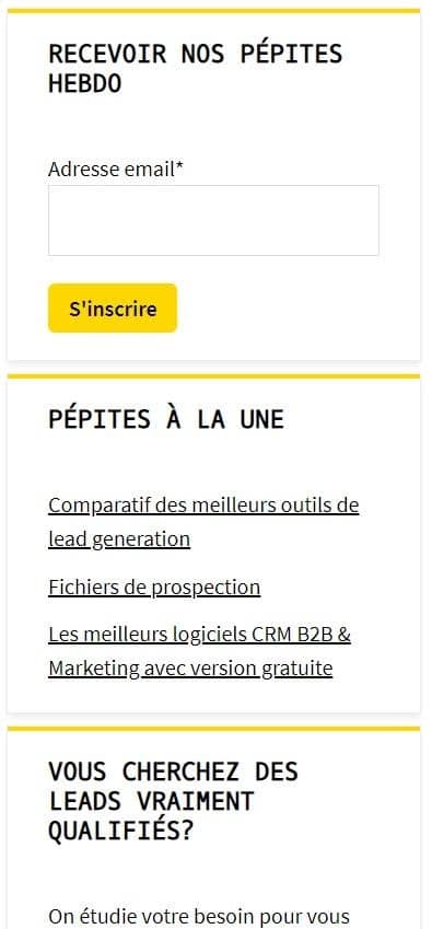
Sidebars are a common navigation feature on many websites. Although their main purpose is to show visitors links to other pages, there’s usually plenty of room to include other content as well. Their size is ideal for highlighting your sign-up incentive, and it gives it a lot of visibility without distracting your visitors. If your site already has a sidebar with plenty of free space, trying this option is a no-brainer. For more crowded sidebars, see if there’s something you can remove to make room for your sign-up form. If you don’t have a sidebar, creating one will probably require a moderate restructuring of the site. However, if you’re struggling to get email sign-ups, it’s worth it.
Include a subscription form in the footer
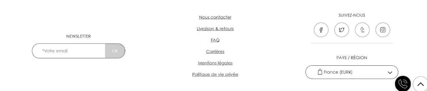
The footer is probably the most common place on websites to include a subscription request. This means that anyone who wants to sign up for your mailing list will often go straight to the bottom of the page expecting to see a sign-up form. One advantage of these forms, beyond the fact that people already expect to find them there, is that since they’re in the footer, they appear automatically on every page of your site. So you only need to set it up once instead of creating it manually on all your pages. While this is far from the most creative way to collect your visitors’ email addresses, it’s an integral part of your website design—almost mandatory.
Display Welcome Gates
If a popup isn’t big enough or doesn’t get enough attention in your view, then welcome gates could be a good option. Welcome gates are full-screen popups that cover the entire page. They appear one or two seconds after the start of the page loading so that users get a real preview of what they’re visiting. This helps prevent people from mistakenly thinking they visited the wrong site or clicked the wrong link. That makes them very similar to landing pages.
Also, it’s important to make sure they don’t show up multiple times to the same person. If someone who has already entered their contact details into the welcome gate sees it again, they’ll probably leave. To prevent this, make sure the welcome gate doesn’t appear to people who have already seen it, and include a clear, easy option to exit the sign-up form. Since they’re relatively new and not as common as popups, they tend not to be as annoying. Don’t be too aggressive—simply and politely ask for your visitor’s address—and you’ll probably get better results.

")


 align Sales and Marketing teams?")